.... Jolien
F2.8-65mm-iso200-1/200s
Speedlite in softbox rechts van camera
Speedlite met snoot links achter model
Jolien in de balletstudio van Lilliane Butler in Terneuzen.
Light: 1sb25 @1/4 links, in white umbrella.
Some pictures of ......
Moderator: Stany Buyle
-
- AFFILIATED MEMBER
- Posts: 144
- Joined: Mon 27 Oct 2008 21:46
Re: Some pictures of ......
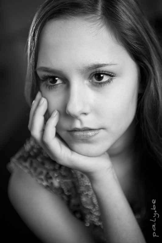
Very nice portrait, the expression on the girls face looks "very portrait"...
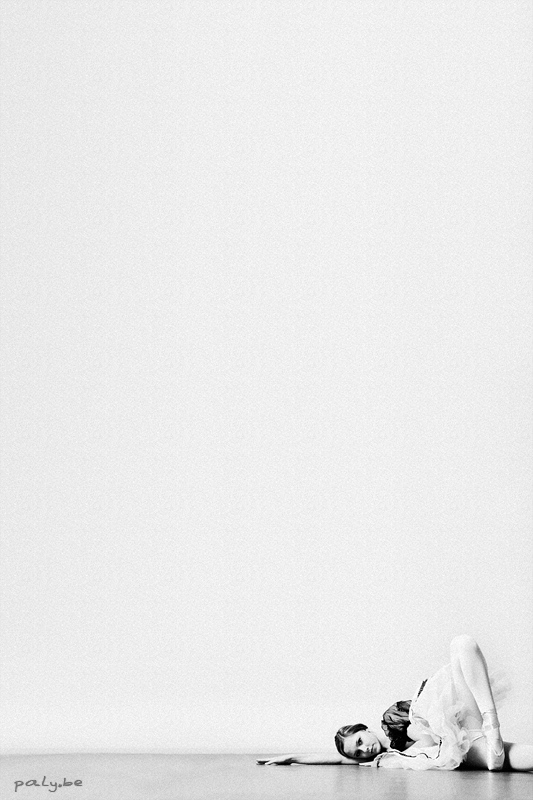
The first ballet picture with its strange subjet place looks like a perfect affiche for a ballet show with text on the left side...
Passioned by beautiful pictures, not a very active photographer though...
Regards,
Vincent
PS I use google translate a lot to write better English. So, if mistake, I's google, not me.
Regards,
Vincent
PS I use google translate a lot to write better English. So, if mistake, I's google, not me.
-
- moderator
- Posts: 468
- Joined: Mon 1 Dec 2008 23:53
- Active Member?: Yes
- Post pictures?: Yes
- Location: Zierikzee, the Netherlands
Re: Some pictures of ......
The first one: I like the crop, when printed it saves you a lot of ink, although in my opinion it is just a tiny little too high.
Second one: lovely light, but the hand is that powerful, it takes over the image. The first thing you see is the hand and it should have been the face. My advice; leave the hands out of the image. you chose to use broad light on her face. I might have had her look into the direction the light is coming from. Now there is a big white space where nothing exiting happens. If it would have been into the shade, this area would have been much smaller. Al in al, a wonderful portrait, wonderful light, a very good poser, but with a little more attention to the details it could even have been better.
Third one: this one has nothing in it for me. The other ones are so much stronger.